Animating a water age analysis
Step-by-step guide
After a water age analysis has been conducted, the results can be viewed as a graph and as an animation of the map theme.
- To open ArcGIS Pro, locate and double-click the appropriate .aprx file.
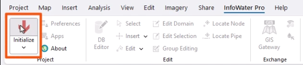
- From the ribbon, select the InfoWater Pro tab.
- In the Project panel, click Initialize.
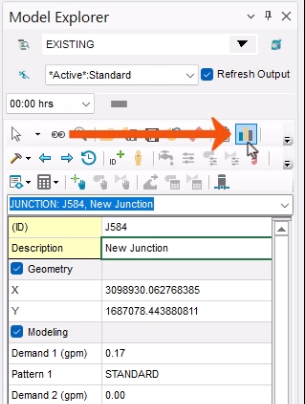
- In the network map, select a junction.
- In the Model Explorer, select the Attribute tab.
- Click Graph.
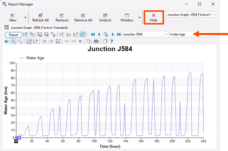
- In the Report Manager, change the graph parameter to Water Age.
Water quality parameters are only listed when a water quality simulation is performed. In this example, there is an initial rise in water age. At Time zero, all pipes are full, and the age is showing as zero because an initial water quality value was not entered. Water quality results typically level out after stable conditions are reached.
- Click Hide to close the Report Manager.
To set up color-coding of the water age simulation results over time:
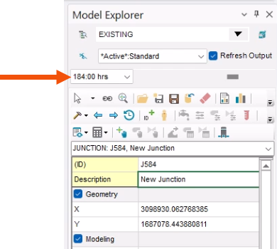
- In the Model Explorer, expand the Output drop-down and select 184:00 hrs.
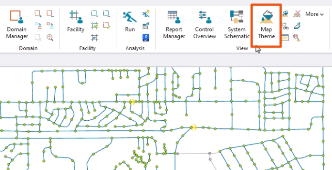
- To set the display options for the animation, on the ribbon, in the View panel, click Map Theme.
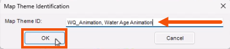
- In the Map Theme Identification dialog, enter a name, such as “WQ_Animation, Water Age Animation”.
- Click OK.
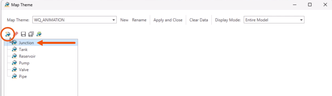
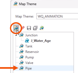
- In the Map Theme dialog, set the element type to Junction.
- To create a new Junction sub-theme, click New.
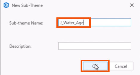
- In the New Sub-Theme dialog, give the sub-theme a name, such as “J_Water_Age”.
- Click OK.
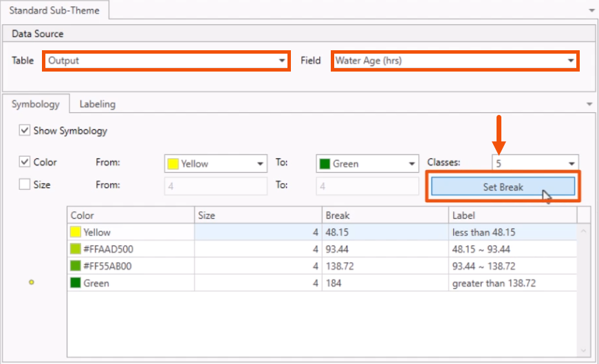
- In the Standard Sub-Theme window, Data Source group, set the Table to Output, and Field to Water Age (hrs).
- On the Symbology tab, set Classes to 5.
- Click Set Break.
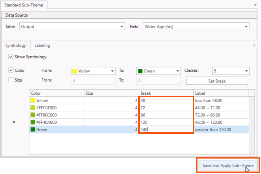
- In the table, leave the values for the colors and size columns.
- Set the values for the Break column to 48, 72, 96, 120, and 240.
- Click Save and Apply Sub-Theme.
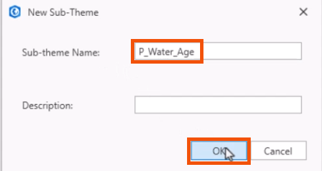
Now, create a pipe sub-theme.
- Set the element type to Pipe.
- Click New.
- Enter a sub-theme name, such as “P_Water_Age”.
- Click OK.
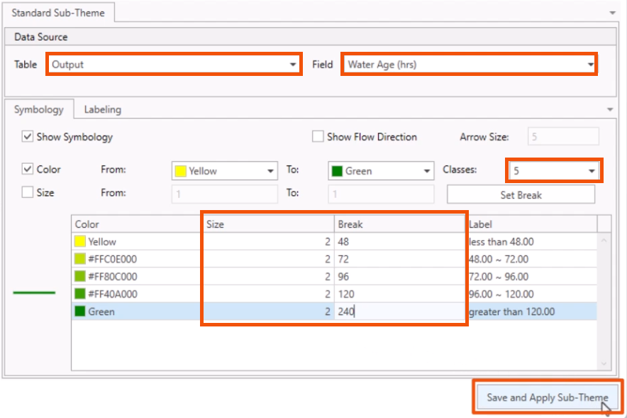
- Again, set the Table to Output, Field to Water Age (hrs), and Classes to 5.
- Click Set Break.
- In the Size column, set all 5 rows to 2.
- In the Break column, set the values to 48, 72, 96, 120, and 240.
- Click Save and Apply Sub-Theme.
- Close the Map Theme dialog.
- In the Model Explorer, for this example, adjust the Output time to 140:00 hrs.
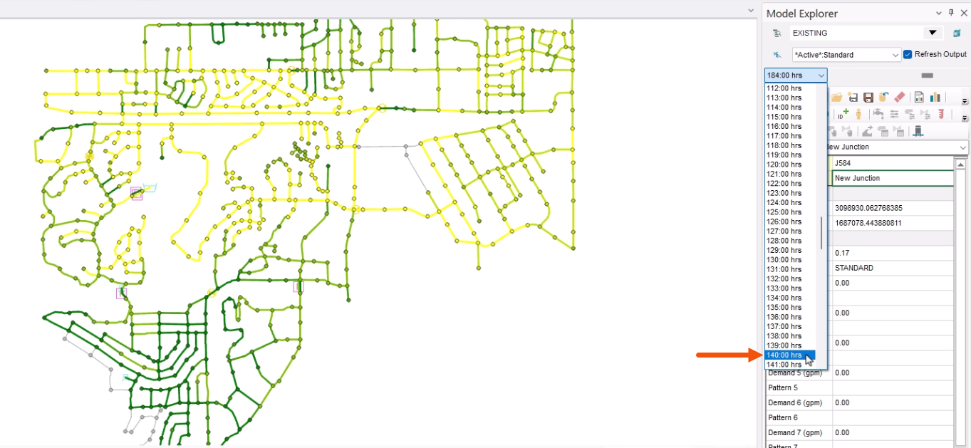
The map updates to reflect the current output values.
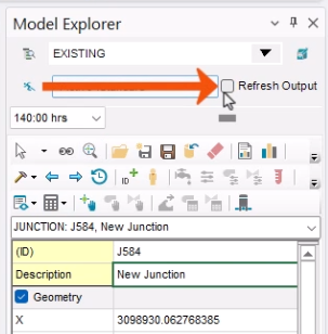
Note that in large models, dragging the time slider may cause the map to freeze as it loads the corresponding timestep data.
- To prevent freezing as new data is loaded, in the Model Explorer, deselect Refresh Output.
- Make sure to re-enable this option to update the map at the desired timestep.
Now, set up an animation of this color-coded map.
- Drag the Output time slider back to 180:00 hrs.
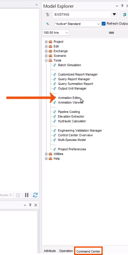
- In the Model Explorer, select the Command Center tab.
- Expand the Tools folder and double-click Animation Editor.
- In the Animation Editor dialog, select Save Animation to File.
- Enter a name, such as “AGE”.
- Click Create.
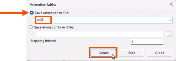
A screen shot is taken of the thematic map at each output timestep. This can take a few minutes to complete. Note that if the model is not zoomed to extents, then the animation will only include the features that were in the viewable map area when the animation was created.
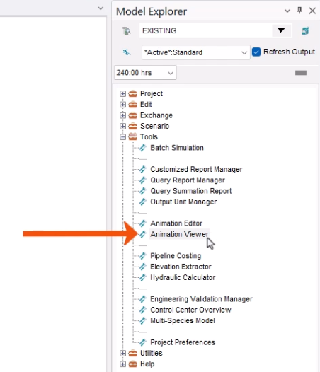
- Once the time steps are recorded, in the Tools folder, double-click Animation Viewer.
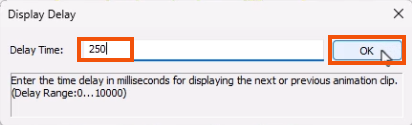
- In the Animation Viewer, click the Delay Setting hourglass icon.
- In the Display Delay popup, set the Delay Time to 250 milliseconds.
- Click OK.
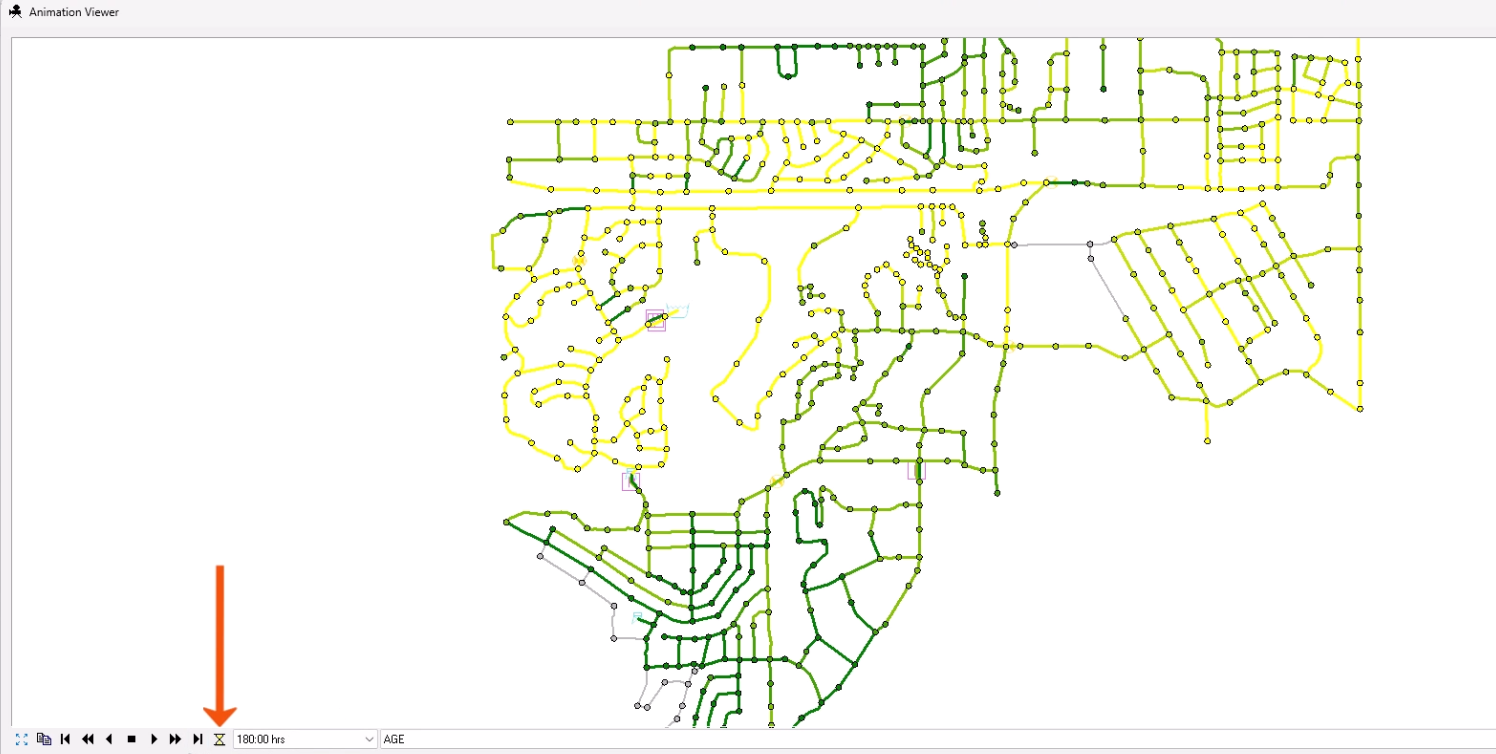
When playing the animation, for optimal results, the viewer should be the same size and dimensions as the map area when the animation was created.
Now, animate the map to see how the colors display the water age within the junctions and pipes over time.
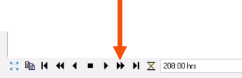
- Click Fast Forward.
As the animation plays, the colors distinguish the areas where the water is moving well. Darker green colors show locations where water may be stagnating.
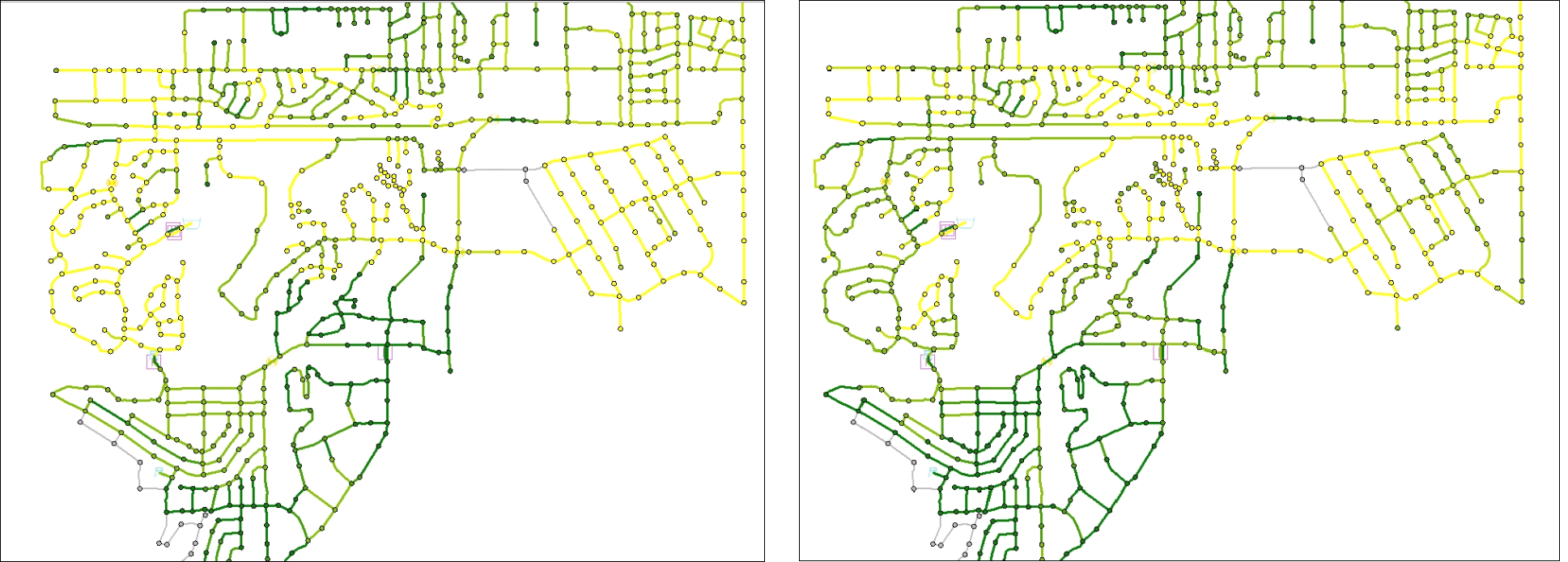
Water pooling up for too long at a specific location can lead to water quality issues, like microbial growth and increased disinfectant byproduct formation. These are the areas where high water age mitigation strategies should be considered.
- Close the Animation Viewer.
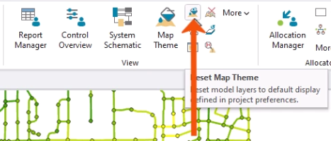
To reset the display to the default, as set in the Preferences:
- On the ribbon, in the View panel, click Reset Map Theme.