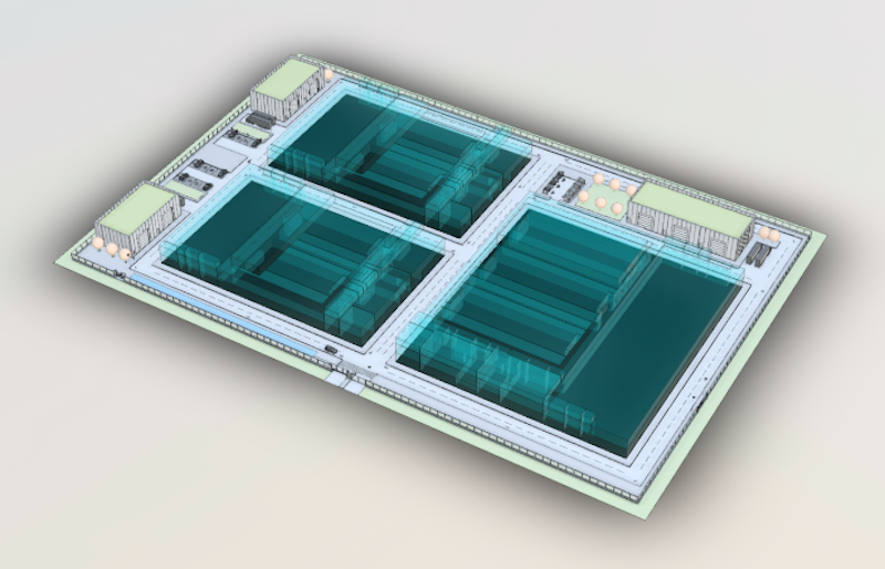
In this article, Adrian Trujillo, BIM Coordinator at Reid Brewin Architects, shares how he explored Autodesk Data Exchange and Power BI to make BIM information easier to access and understand on a complex data centre project.
Data centres are some of the most information-intensive projects I have worked on. Their complexity comes not only from the scale of the buildings, but from the number of critical systems that need to operate together. IT capacity, electrical infrastructure, cooling, backup power, fire protection, physical security, telecommunications and operational requirements are closely interconnected, and each of them generates information that needs to be coordinated throughout design stage.
BIM gives us an effective environment for managing that complexity, but as the models become richer, another challenge appears. The information may already exist in the model, yet answering a simple project question can still require opening views, schedules, properties, or individual elements. I wanted to explore whether we could keep the BIM model as the technical source of information while providing a more direct way for people such as specific subcontractor, clients and other stakeholders to understand selected project data.
That led me to Autodesk Data Exchange and Power BI. Rather than creating another disconnected dataset, the objective was to connect information already contained in the BIM environment to a dashboard that could present it through model views, filters, metrics, and charts.
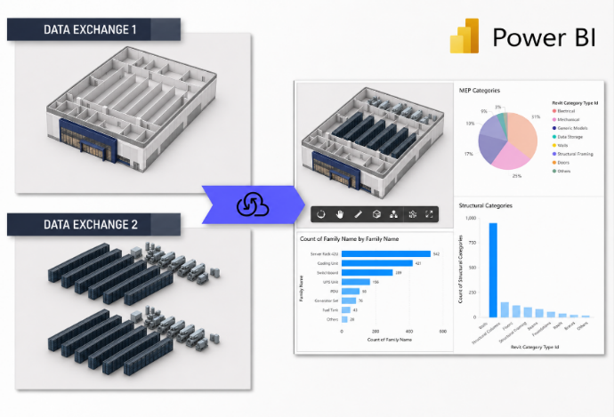
I explored this approach on a data centre hub comprising three data centres. The questions we wanted to answer were practical ones.
We wanted the dashboard to help users understand the project quickly without asking them to navigate the same level of detail that a BIM specialist would normally work with.
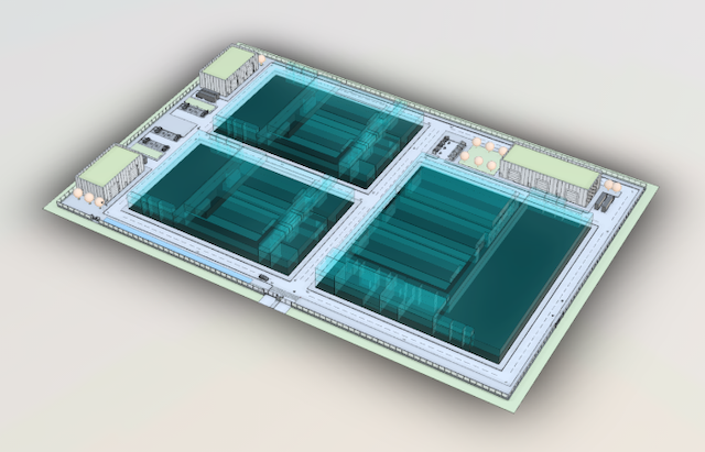
One of the most useful decisions was to simplify the 3D representation. Instead of displaying every wall, duct, pipe, cable tray, structural element and piece of equipment, we used masses to represent the main areas of the project. These simplified volumes made the spatial organisation of the data centre much easier to read while still giving the information a clear location in the model.
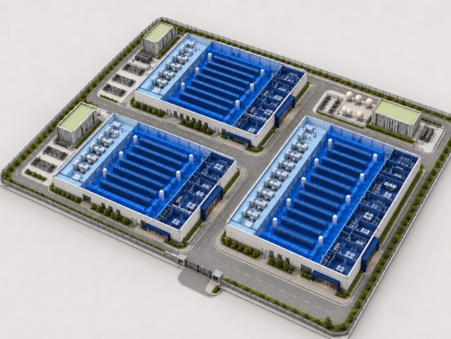
That became an important principle of the workflow, the dashboard did not need to reproduce the BIM model. It needed to show enough geometry to help people understand the data.
Before connecting the information, we also had to make sure it was structured consistently. Parameters, naming conventions and classifications matter because a dashboard can only interpret the information it receives. If the underlying BIM data is inconsistent, the dashboard will reproduce those inconsistencies.
Our first prototype relied on IFC because the Revit versions used on the project did not provide the room volumes we needed through Data Exchange. IFC allowed us to the volumes called as IfcSpace, but it also required additional preparation when bringing multiple models together. As Data Exchange evolved, the introduction of the Navisworks connector provided a much simpler route for working with federated model information.
Today, the workflow can be centred on Navisworks as the federated environment. Revit, Tekla, IFC models and others can be brought together there, and Autodesk Data Exchange can publish selected geometry and properties from the coordinated model for use in Power BI. This gives us a straightforward workflow:

For me, the important part is that the workflow is no longer tied to one authoring model. Navisworks can act as the point where different sources are coordinated, while Data Exchange provides the connection to the dashboard.
It also reinforces the need to be selective. A data centre model may contain huge quantities of information, but Power BI does not need all of it. We only need the geometry and properties that help answer the questions the dashboard was designed around.
Power BI is where the workflow becomes accessible to a wider audience. The dashboard combines a simplified 3D model with key metrics, project information, area by level, area by department and detailed information. Instead of navigating thousands of model elements, users can interact with filters and visualisations built around the questions they actually want to answer.
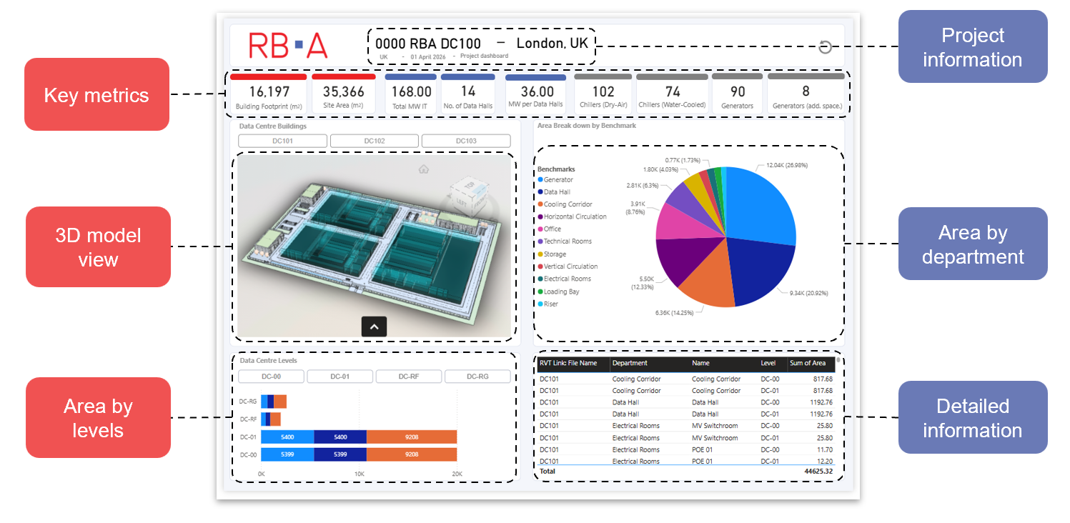
The masses are particularly useful here. The chart shows the total area assigned to a department, while the 3D view helps the user immediately understand where that department sits within the data centre. The same principle can be applied to data halls and other important areas. The model gives spatial context to the numbers without overwhelming the user with unnecessary detail.
This was the main value of the exercise. The information was not new; it already existed within the BIM environment. What changed was how quickly it could be interpreted. The detailed model remains available for designers and BIM specialists, while the dashboard provides a simpler interface for people who need to understand the project rather than author or coordinate it.
The model remains the technical source of information. Data Exchange creates the connection, and Power BI translates selected information into a form that is easier to explore and communicate.
The most useful lesson from this workflow was that more detail does not always create more clarity. On a complex data centre project, showing every available model element can make it harder to communicate the information that matters.
By simplifying the geometry into masses and connecting selected BIM information through Navisworks, Autodesk Data Exchange and Power BI, we were able to focus the dashboard on a small set of practical questions while maintaining a relationship with the underlying model.
Technology is only part of the solution. The information still needs to be structured consistently, and the questions need to be defined before building the dashboard. But once those foundations are in place, a complex BIM environment can be translated into something much easier to navigate.
A dashboard does not replace the BIM model. It makes the information within that model easier to understand so it can support better decisions.